Even though we all know how lousy a spring and summer we’re having – a national picture does help. Here are a couple of images indicating problems facing farmers. If you recall, March was very pleasant and the early warm period after the wet and warm winter meant grass growth got of to a flying start. The image below shows biomass (NDVI*) at the begining of april compared with the average value at the begining of april for the last 10 years- red means above the average, blue means below. And you can see why farmers were happy:

Grass growth in Ireland start of April 2012, compared to the 10year average.
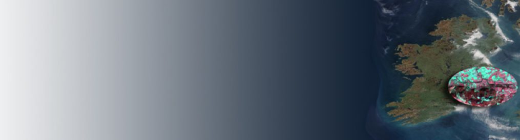
And below is the same image only calculated for the end of April 2012, against the average end April value for the last 10 years. So we can see things started well but quickly got worse:

Grass growth in ireland Endof April 2012, compared to the 10year average for End of April.
* The images are derived from MODIS Terra 16 Day 250m NDVI composites – MOD13Q data obtained from site http://lpdaac.usgs.gov/get_data maintained by the NASA Land Processes Distributed Active Archive Center (LP DAAC), USGS/Earth Resources Observation and Science (EROS) Center, Sioux Falls, South Dakota.
